Brand Identity Activation:
BurnCycle Studio

The brief.
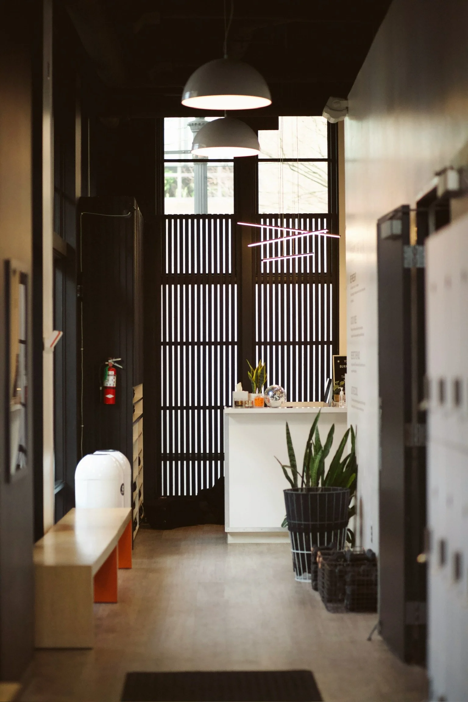
We were tasked with bringing the BurnCycle brand to life in their physical studio space through a series of permanent art installations meant to reflect the ethos of the brand and community. In collaboration with BurnCycle owner Jessi Duley and Mandy Riggar Interiors and through thoughtful spacial planning, intentional material sourcing appropriate for a small business budget, and graphic design implementing brand assets into the new concept, we brought their vision to life.
Phase one.
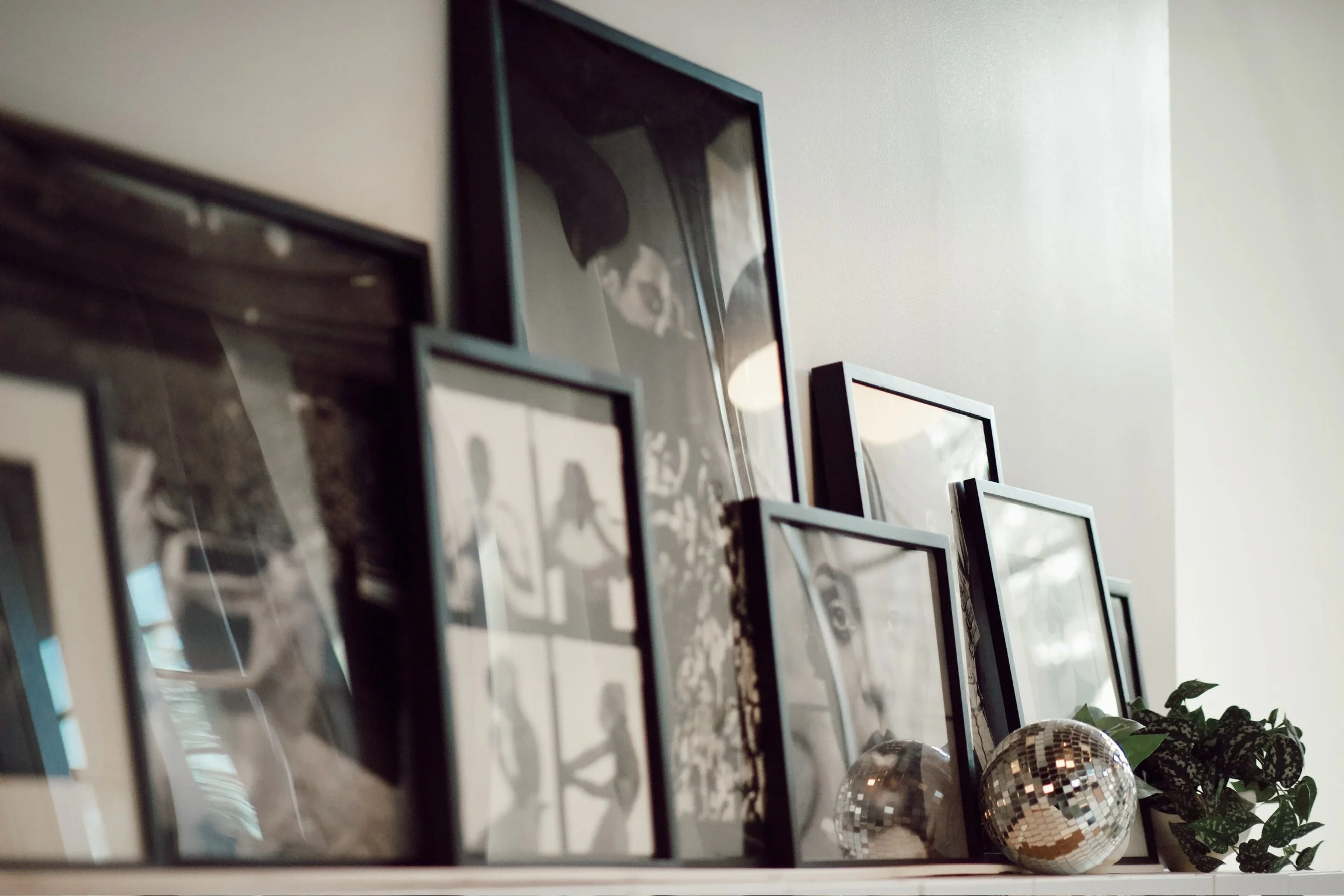
Music, specifically the beat of music, is at the heart of everything BurnCycle does. In order to represent this important experiential value, we developed a layered gallery wall of framed black and white posters highlighting iconic artists as a nod to their music and the way that it portrays the feeling clients experience while in the studio’s space.


Photos by Allie Day
Phase two.
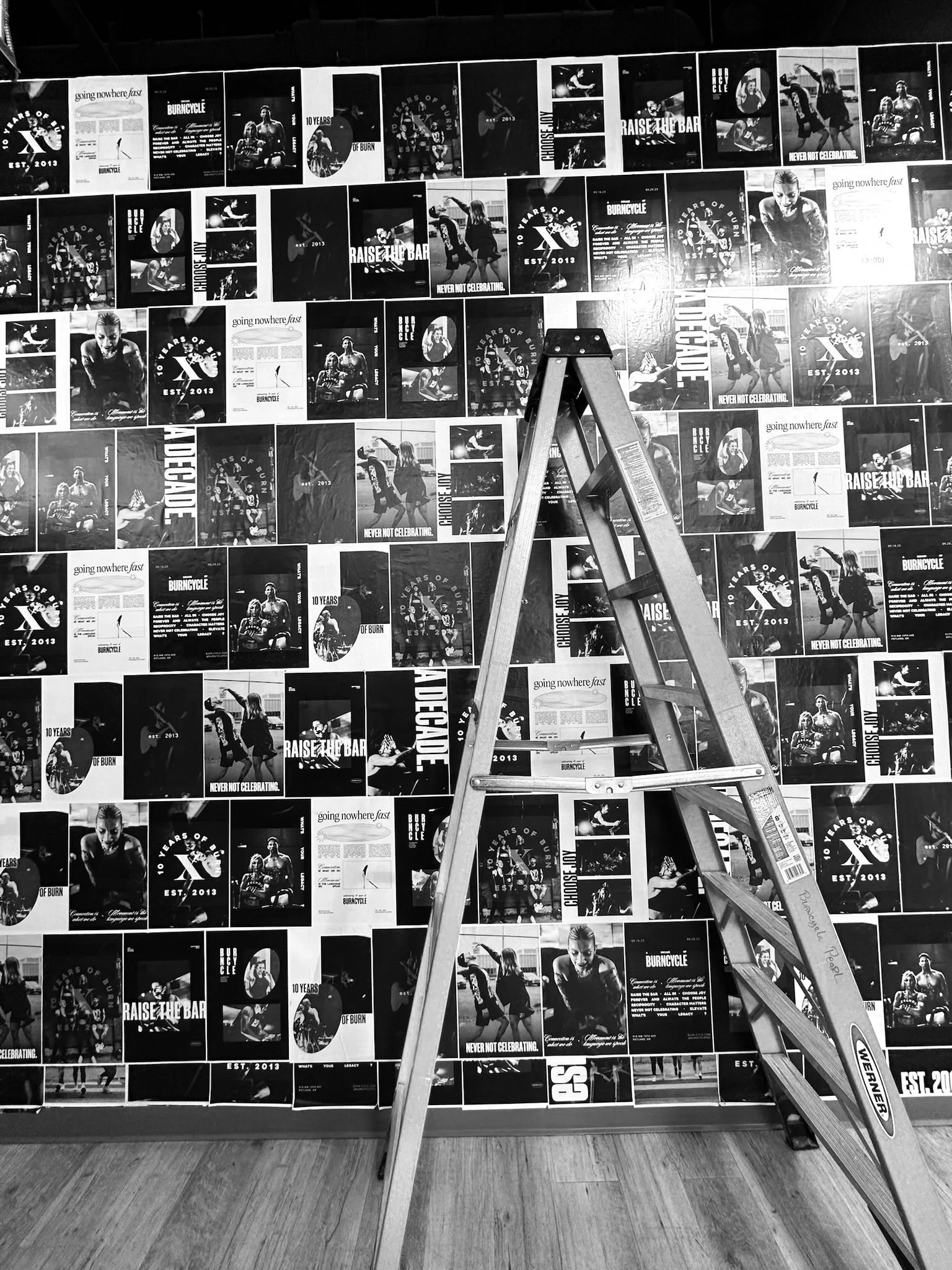
The BurnCycle brand is marked by a combination of high-end experiential luxury with gritty street style. In order to represent this unique intersection, we developed a concept that would represent the brand’s message through imagery, graphics, and voice while maintaining a clean and high-end aesthetic.
Following the style of a wheat pasted poster wall you’d find in a construction zone, on a phone pole, or on the side of a city building, we designed a series of 16 posters to install using the wheat paste adhesive method in a varying pattern to achieve the intended look.
The poster designs are updated quarterly to coincide with the brand’s ever-evolving campaigns and client-facing messaging.

